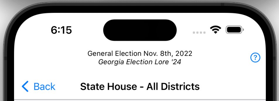
You are Here
The top of screen describes where you are and what you are looking at. The very top line tells you which election you are exploring. The bold large title tells you which contest you are viewing.
Red or Blue?
The key components of the Red or Blue? tab are maps and election results. The maps display both affinity and voter density. They show counties for statewide contests and districts of legislative contests. The can also show which districts are uncontested.
Maps
The first thing you see when you tap on a General Election selection is a map. The map is not all that’s there, but it is central to conveying a description of the contest as a whole without reducing it to a single number. There are several kinds of maps.
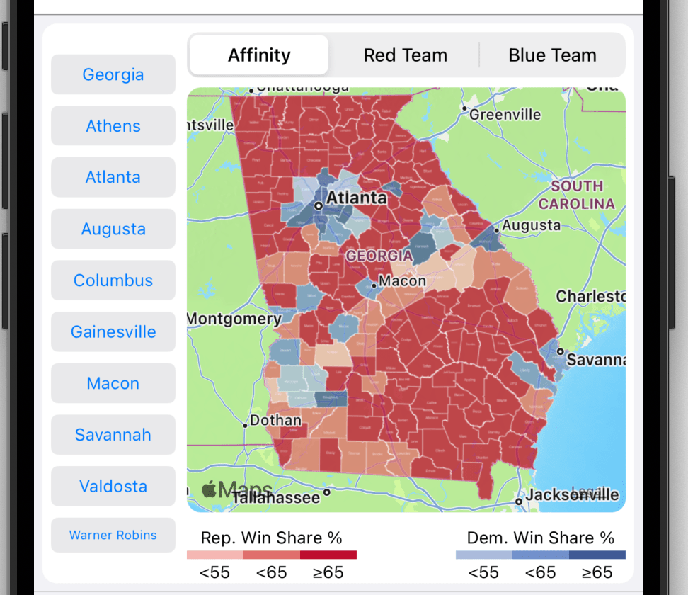
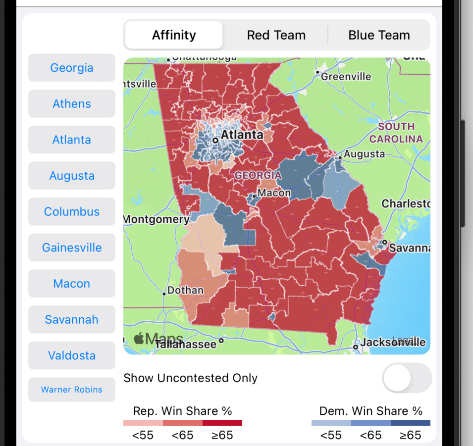
Affinity: An affinity map shows which party carried region a using the colors red and blue. Blue indicates that the Democratic Party carried the region. Red indicates that the Republican Party carried the region. The sized of the win margin is indicated by different shades. A light shade indicates a weak victory and a dark shade indicates a strong victory. For example, if a county is red, it was carried by a Republican candidate. If district is blue, it was carried by a Democratic candidate. Note the following:
- buttons for selecting the map type at the top
- the legend at the bottom of the map
- quick region navigation buttons at the left
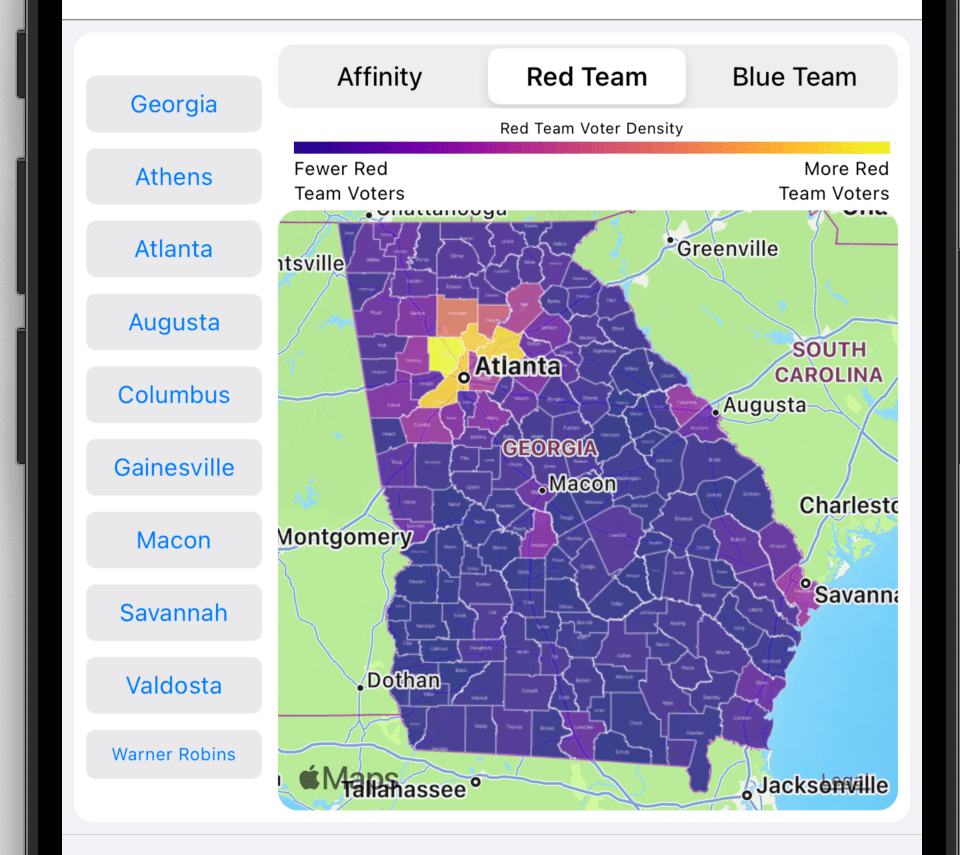
Red Team: A Red Team map shows Republican vote magnitude. The largest number of votes are indicated by a bright yellow color and the least number of votes are indicated by a dark blue color. For example, When looking at the Governor’s contest, Cobb county is a bright yellow. In fact, it is brighter than any other county. This bright color indicates that Cobb delivered the most Republican votes in the state. Note legend at the top.
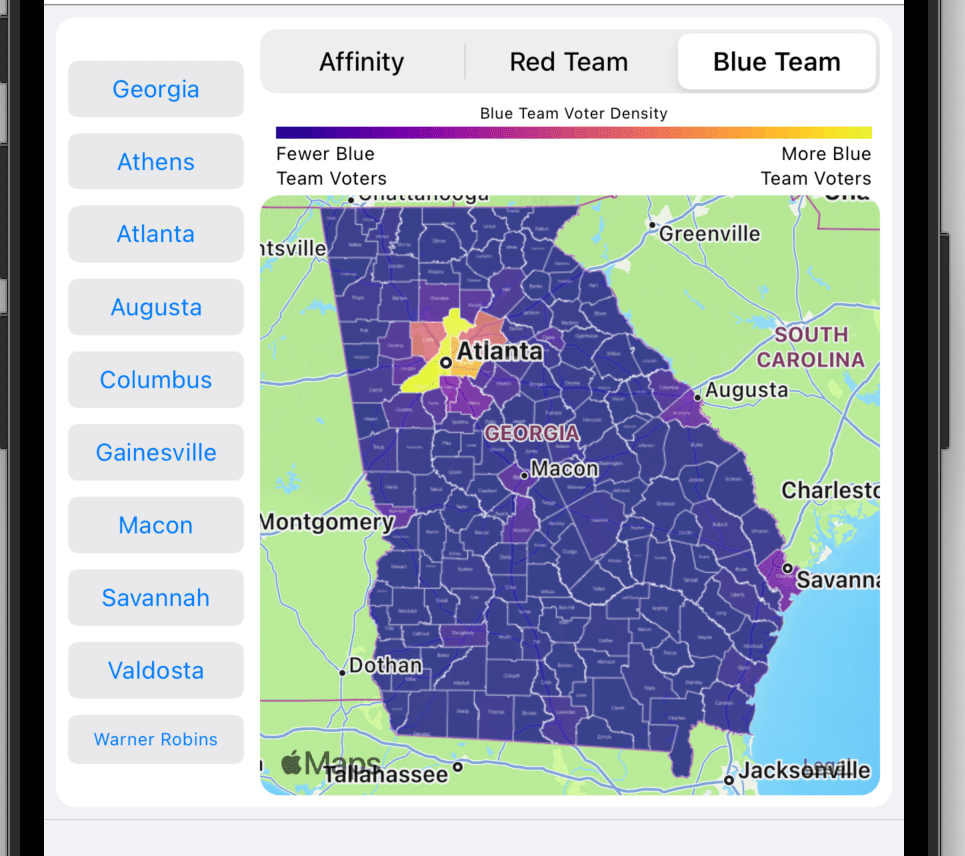
Blue Team: A Blue Team map shows Democratic vote magnitude. The largest number of votes are indicated by a bright yellow color and the least number of votes are indicated by a dark blue color. For example, When looking at the Governor’s contest, Fulton county is a bright yellow. In fact, it is brighter than any other county. This bright color indicates that Fulton delivered the most Democratic votes in the state.
County Map: County maps are used in statewide contests. They show at a county level which party carried a county (Affinity) or which county amassed the most votes for a party (Red or Blue Team). Tap the county to view county specific details.
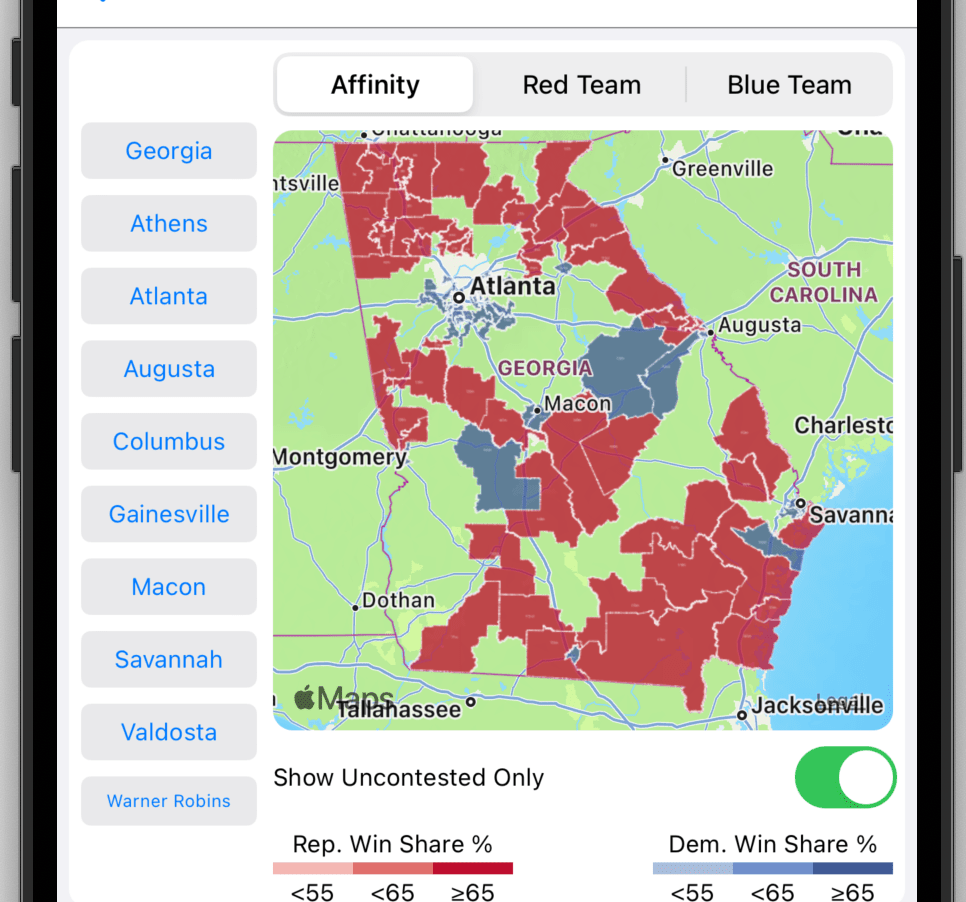
District Map: District maps are used in legislative contests. They show at a district level which party carried the district (Affinity) or which district amassed the most votes for a party (Red or Blue Team). Tap the district to view district specific details. A district affinity map can also show which districts are uncontested. Toggle the Show Uncontested Only to show only uncontested districts.
The map below shows uncontested State House districts. The State Senate and House have numerous uncontested districts. The US House has no uncontested districts.
Election Results
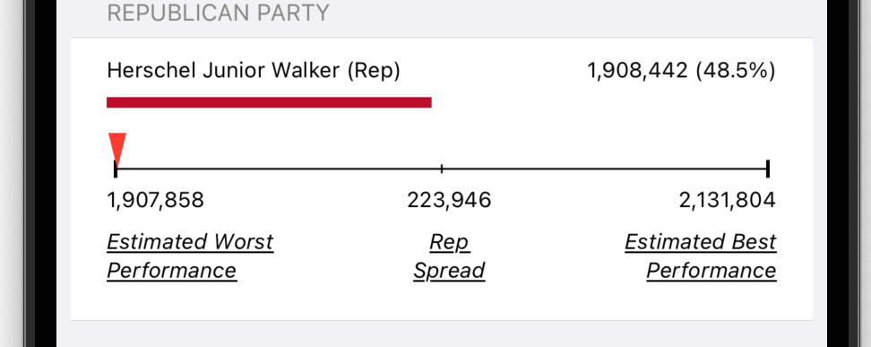
The next section provides election results for the contest, which consists of the choices, vote count, share, and spread for each party. The election results are concluded with an undervote tally. Bear in mind, you will need to scroll the screen to see all the election result content.
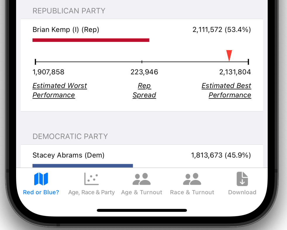
Vote Spread
The vote spread depicts how well a given candidate performed in comparison to other candidates of the same party. The essential point in this comparison is some voters split their tickets. What that means is that given some set of votes two candidates in the same party get a different number of votes. For example, Walker in the US Senate contest received more than 200,000 fewer votes than Kemp in the governor’s race. The vast majority of that 200,000 vote difference went to Senator Warnock. Some of them when to Oliver (Libertarian). And the rest ended up as undervotes. Using vote counts at the precinct level, one can estimate the likely best and worst party performance. This spread represents the swing vote. It also suggests that some candidates could have done better whereas in some contests different candidates could have done better.
Tab Bar
There are five buttons in the tab bar:
- Red and Blue?: Shows a heat map with a list of candidates
- Age, Race, & Party: Illustrates the relationship between age, race, and party affinity
- Age & Turnout: Shows the relationship between age and voter turnout
- Race & Turnout: Shows the relationship between race and voter turnout
- Download: Shows data download selections for the displayed contest
