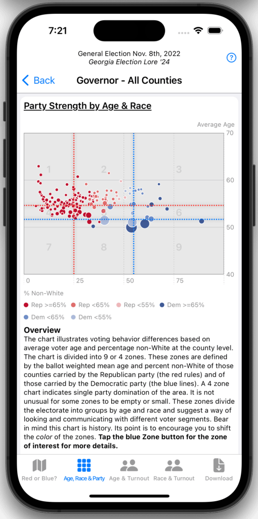
The General Election Age, Race, and Party shows party wins by county and district in a scatter plot. Each dot represents a county, district, or precinct (precinct is only available with subscription). Dots are placed on the plot based on the mean age and percent non-White of the region being represented (county or district). The color of the dot indicates which party carried a region. The size of the dot gives a general sense of the size of the population represented by the dot. The point of the plot is to illustrate that party strength is correlated with age and race.
The chart is divided into 9 or 4 quadrants. A 4 quadrant variant is generated when one party dominates the contests. In any case, the quadrants divide the electorate into groups by age and race and suggest a way of looking at and communicating with different voter segments. Bear in mind, this chart is history. The point of the chart is to encourage you to use this insight to shift the color of a zone in your favor.